 Summary
Inserts a HTML (WYSIWYG) editor.
| Category | AS Miscellaneous |
| Version | 2.1 |
| Complies with Xhtml 1.0 / 1.1 rules | Yes |
| Supported server programming languages | C# Visual Basic.NET |
| Output content type | inline |
When placed along with a Webitor templates component the Webitor might look like the sample below.
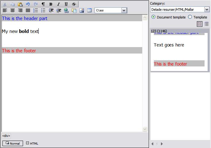
The webitor with a template area
When to use
This component is typically used when there is a need to provide an WYSIWYG editor on a web page or edit template.
 Programming interface
Parameters
- Name of the field
- Component field name
- the name of the component. This name must be unique per page and can only contains characters in ther range [A-Ö][0-9] and _.
- Size of the control
-
The width and height of the control. These values should be a floating-point number, followed by an absolute units designator (cm, mm, in, pt,
pc, or px)
or a relative units designator (em or ex). - Width
- The displayed with of the component.
- Height
- The displayed height of the component.
- Color of the component
- Background color
- A background color of the component.
- Buttons and functionality to display
- Standard buttons
- Display the cut, copy, paste, undo and redo buttons.
- Standard formatting
- Display the bold, underline, italic and strike-through buttons.
- Alignment
- Display the left, right, center and justify -alignment buttons.
- Bullets and numbering
- Display the bullets, numbering and indentation buttons.
- Hyperlink
- Display the hyperlink and bookmarks buttons.
- Templates
- Display the insert template button.
- Image
- Display the insert image button.
- Table
- Display the insert table button.
- CSS class name selector
- Display the css class name selector.
- FontAndSize
- Display the font and size controls in the toolbar.
- Heading
- Display the heading control in the toolbar.
- Object
- Display a button that enables the user to insert a live object.
- User Control
- Display the a button that allows the user to insert a User Control.
- Server Control
- Display a button to allow the user to insert a Server control.
- Font
- Display the font face and size controls in the toolbar.
- Code
- Display the buttons for switching to HTML and code view
- Display html-tags.
- Display html-tag information.
- Disable context menu in browse dialog
- Disable the context menu in the standard browse dialog.
- Paste with no formatting
- If this argument is true the html formatting will automatically be removed when content is pasted into the control.
- HideAllFormatting
- Hide all formatting in the webitor including all buttons except html-tag buttons.
- CSS class names
- Optional, a comma separated css class names to use. If entered, only this set of css class names will be enabled in the css class picker.
- Breake after number of buttons
- Make a brake in the main toolbar after specified number of buttons. 0 = never brake.
- Direct file upload
- Display file attachment button
- Display insert file attachment. Requires a category.
- Category for file
- Category for file attachments.
- Target for file
- Default target for file attachments link that will be created.
- Image and link locations
- Default image location
- Optional, the default location when browsing for images.
- Lock image location
- Lock image location
- Default link location
- Optional, the default location when browsing links
- Lock link location
- Lock link location
- Live object
- Default object location
- Optional default location for browsing objects
- Lock object location
- Lock object location
- Bypass object URL dialog
- Bypass object URL dialog
- Object editing level
- Object editing level. This setting manage whether live objects can be managed by a user or not.
- User Control
- Default User Control location
- Optional default location for browsing User Controls
- Lock User Control location
- Lock User Control location
- Initial content and headers
- DefaultContent
- Default content
- DefaultHeader
- Default header. Use this field to override default styles defined.
- XHTML
- Document type output
-
Regulates the type of Html that is generated.
- HTML
- XHTML, 1.0 transitional
- XHTML, 1.0 strict
- XHTML, 1.1
-
Note
The XHTML, 1.0 strict and XHTML, 1.1 rules are very strict compared to ordinary Html or Xhtml and is indented for advanced users only. - Force xhtml dtd validation
- If this parameter is set all HTML code must be valid before the document can be saved
- Custom buttons and functions
- Custom button icon
- A URL for an icon to use with a custom button, can be | delimited.
- Custom button function name
- the name of a javascript function to execute for custom button, can be | delimited.
- Custom button tooltip
- The text of the tooltip for a custom button, can be | delimited.
- Custom browse link function
- The name of a javascript function to be executed instead of standard browse link dialog. The custom function should have one argument. The passed value will be an array consisting of unit id, category id, document id(multidimensional), document name(multidimensional) and document url(multidimensional). The function should also return the same type of array.
- Custom browse image function
- The name of a javascript function to be executed instead of standard browse image dialog. The custom function should have one argument. The passed value will be an array consisting of unit id, category id, document id(multidimensional), document name(multidimensional) and document url(multidimensional). The function should also return the same type of array.
- Custom browse object function
- The name of a javascript function to be executed instead of standard browse object dialog. The custom function should have one argument. The passed value will be an array consisting of unit id, category id, document id(multidimensional), document name(multidimensional) and document url(multidimensional). The function should also return the same type of array.
- Themes and styles
- Inherit styles and themes
- Inherit styles and themes from the edit templete where the Webitor is inserted.
- Theme
- Specifies a valid theme identifier in the webitor
Remarks
This component works only with Internet Explorer 6 and later. If another browser is used, an ordinary textarea will be displayed.